People familiar with Excel's chart wizard will know that it is very easy to set colours for a data series. It's very much a graphical point and click process. Things aren't quite so easy or obvious with Reporting Services. I've seen this cause problems during past development projects which consolidate reports from spreadmart sources into a central BI service centre. Often users will have developed Excel based reports with particular colours in various charts and will want those colours carried forward into the new centralised Reporting Services versions of those reports in order to convey or highlight meaning. I have seen developers tell end users that the colour selections can't be carried across as the new tool lacks the functionality to control colour.
This isn't true. It may not be immediately apparent - but it is reasonably straightforward to set the colour for a data series. If only one colour is required then it can be set by following the steps below:
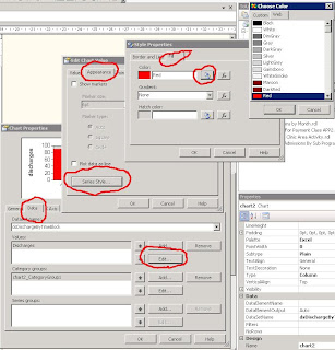
- Open the Chart Properties
- Select the Data tab
- Press the Edit button for the Values section
- Select the Appearance tab
- Press the Series Style button
- Select the Fill tab
- Press the Colour button
- Select the colour required.

It's also possible to control the colour of different elements within the chart. The example below shows discharges from a health care facility across various blocks of time during the day. The chart can be given more impact by highighting discharges that occur outside of the expected times. To show this we set the colour of bars for the worst times to be red, the bars for the less severe breaches to be yellow and the remaining bars for discharges in compliant times to be green.
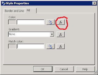
A little code is required to achieve this. Firstly bring up the Style properties window in the same way as you would to just set one colour. But rather than using the colour button, select the function button that sits beside it.

The following code will set the colour of the chart's bars.
=Switch(Fields!TimeBlock.Value = "1600 - 1800" OR Fields!TimeBlock.Value = "Unknown", "Yellow", Fields!TimeBlock.Value = "Pre 10am" OR Fields!TimeBlock.Value = "1800 - 2400", "Red", 1=1, "Green")
The Switch statement in Reporting Services works in much the same way as T-SQL's CASE statement. There is no specific equivalent of the ELSE part of the CASE statement. In this example I've used an expression which will always be true (1=1) to force a default colour of green.
The end result is a chart in which the colours are not automatically set by SSRS, but rather are choosen and selected based upon data values found at runtime.


 There is a better way. The trick is to convince Crystal that you only have a single statement in each of the code blocks - i.e. one statement for the IF block and another for the ELSE block. You can do this by enclosing each block in a set of parameters, like this:
